Discover how our nondescript and badly designed shower room was transformed into a modern family bathroom with simple luxe textures and Art Deco vibes.
With our bathroom measuring 3.15 m², I naively thought that redesigning such a small space somehow meant that it was going to be easy – I was wrong. Though our bathroom now feels like a little pocket of luxury, it’s taken eight long weeks of blood, sweat and tears (okay, maybe not blood), to transform it into the tranquil space that it is now.
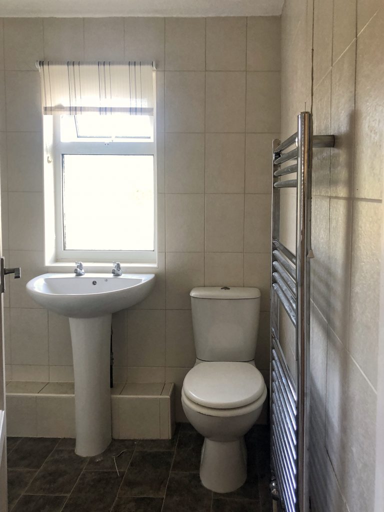
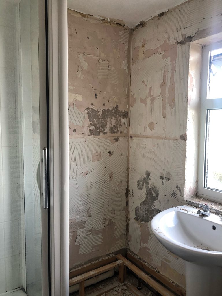
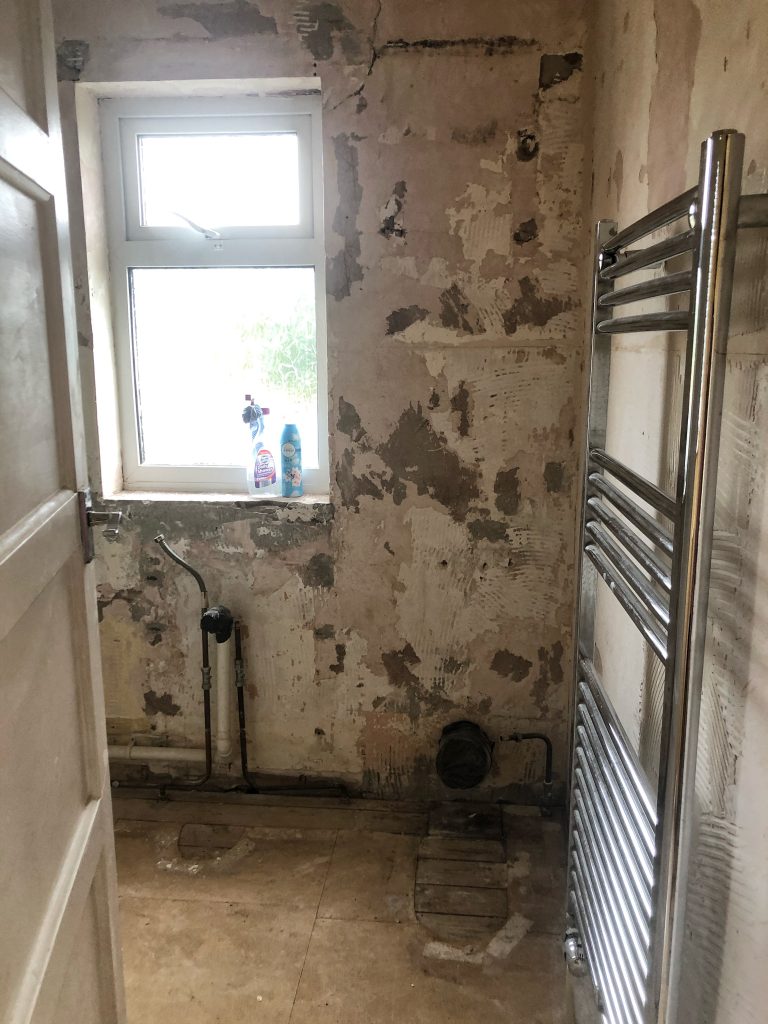
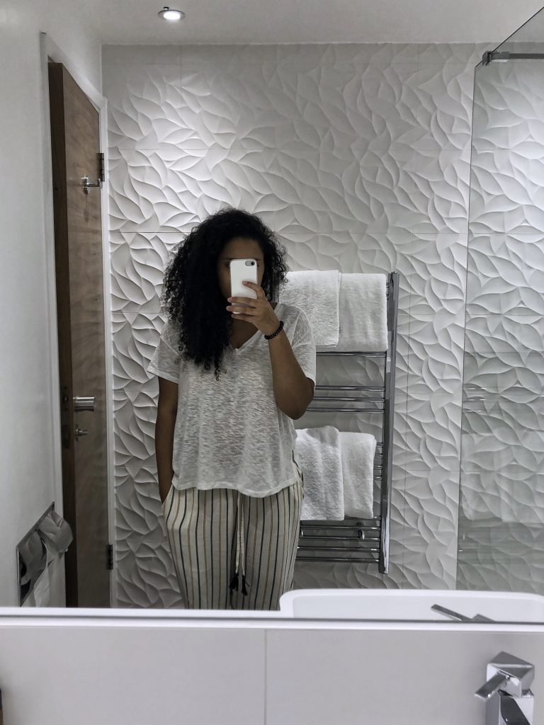
‘Before’ 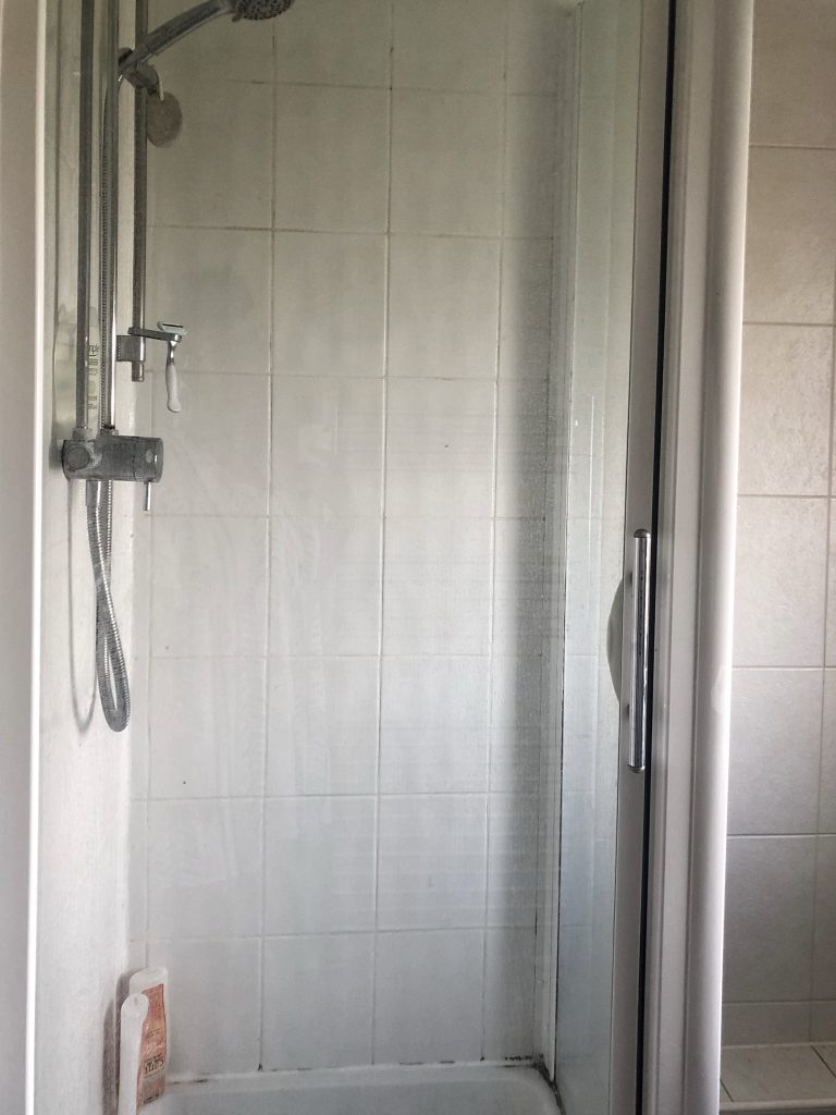
Previously a shower room
Redesigning the layout
One of the first challenges that we faced was deciding what was actually going to be fitted in the new bathroom. Originally a shower room with a corner of wasted space, I was adamant that we could transform it into a family bathroom complete with a standard-sized bath and waterfall shower; however Tom was happy to just update the space with a more modern walk-in shower. Whilst us adults rarely use a bath, it’s always been an integral part of our daughter’s bedtime routine (and will be for many more years to come) so it’s something I ultimately wasn’t prepared to give up – baby girl loves those bubbles!
‘Before’ 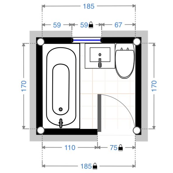
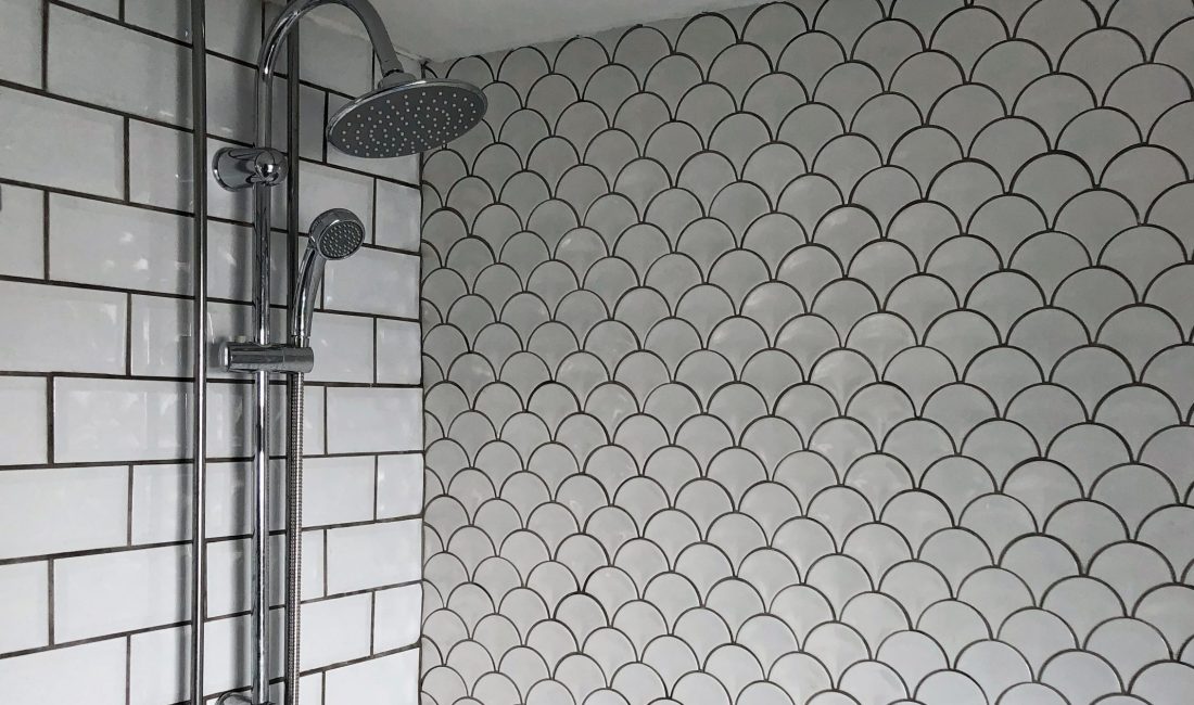
‘After’
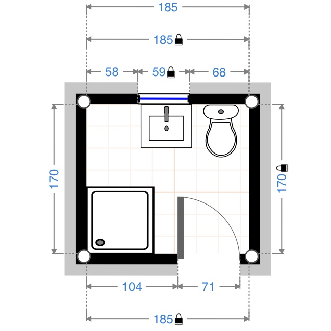
In order to convince Tom that it was achievable in the small space, I downloaded a floor planner app and spent hours playing around with different layouts trying to suss out what could work. I shared some of my floor plan ideas on Instagram stories and lucky for me, an architectural designer that I know, James Wollerton, saw them and messaged me with a bit of advice and much-needed reassurance.
James confirmed that we would be able to fit a standard size bath along the left-hand side, running from wall-to-wall, something that I had initially thought would be too tight a squeeze. He also suggested looking at a combination basin and WC unit to save space – an option that I hadn’t even considered! With this advice in mind, I managed to put together a layout that was simple and worked perfectly with the tight dimensions – so thank you James!
Cost savings
With the layout confirmed, we were finally able to start organising what and who we would need to make the redesign happen. The layout provided such a simple solution that we did not need to drastically move any of the existing pipework – the over-bath shower would go where the old shower was, and the basin and WC unit would also sit where the old ones were – this meant that we did not need to hire a plumber, which was a big cost saving.
We did however have the advice of Tom’s Dad who has years of DIY/building experience, and Tom is a skilled grafter, so I would recommend doing plenty of research before undertaking any plumbing-associated work yourself. Whilst the work was being carried out, we uncovered a historic leak in one of the pipes; this resulted in plasterboard falling off the ceiling in our kitchen beneath, and again we had to lean on Tom’s dad for assistance – shout out to our very own Del Boy!
All of the labouring work on the bathroom (except for the electrics and plastering) was carried out by Tom or another family member, so this was where we saved the most money.
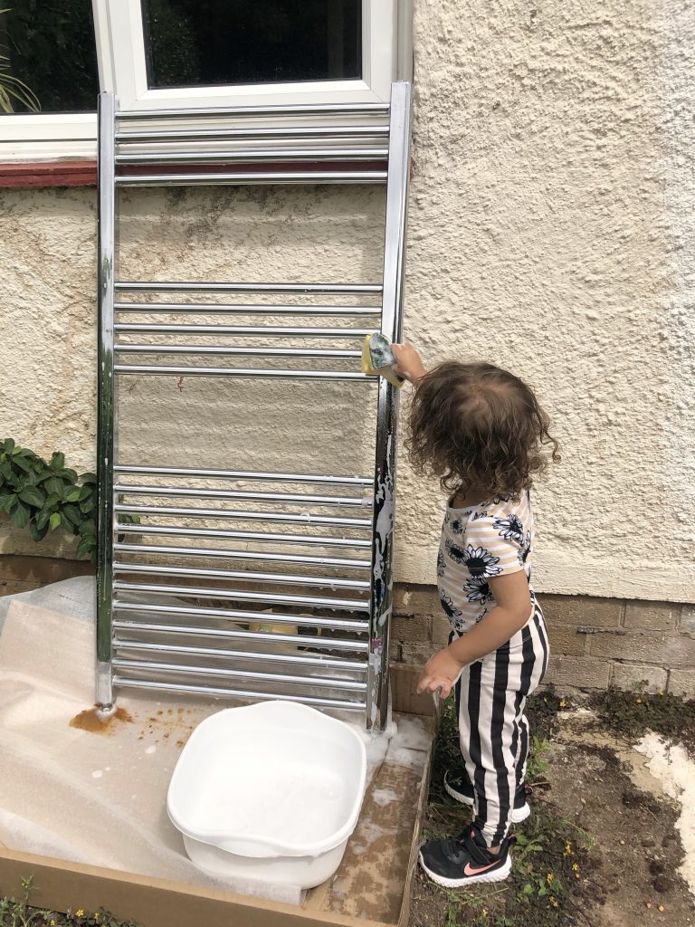
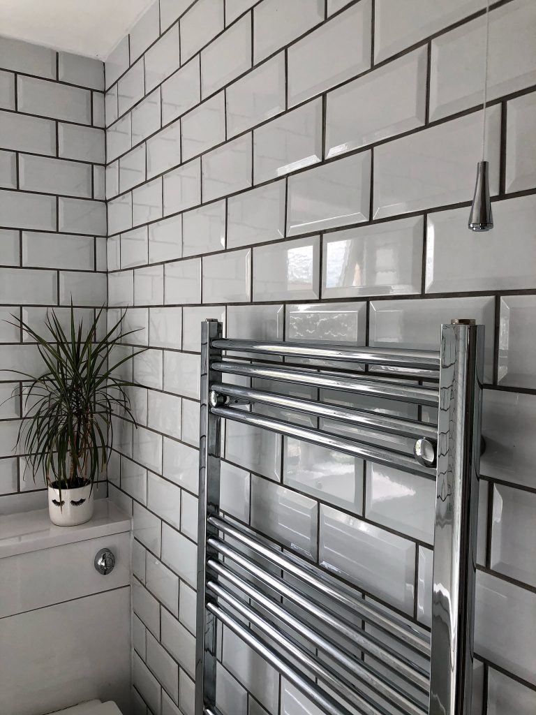
In terms of cost-saving on materials, we decided to repurpose the existing heated towel rail – a simple chrome design that fitted well with my interior decor plans. The rail was removed for cleaning, and then put back in exactly the same place.
Hotel inspo 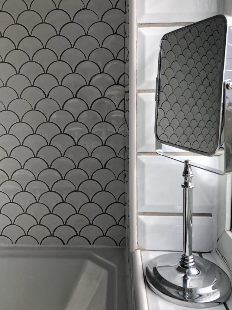
Interior Scheme
I first gained inspiration for our interior scheme when we stayed at Wyboston Lakes Resort earlier this year. The room we stayed in had an all-white bathroom, which felt fresh and calm, and although I wasn’t keen on the tiles used, it made me realise that all-white didn’t have to be clinical.
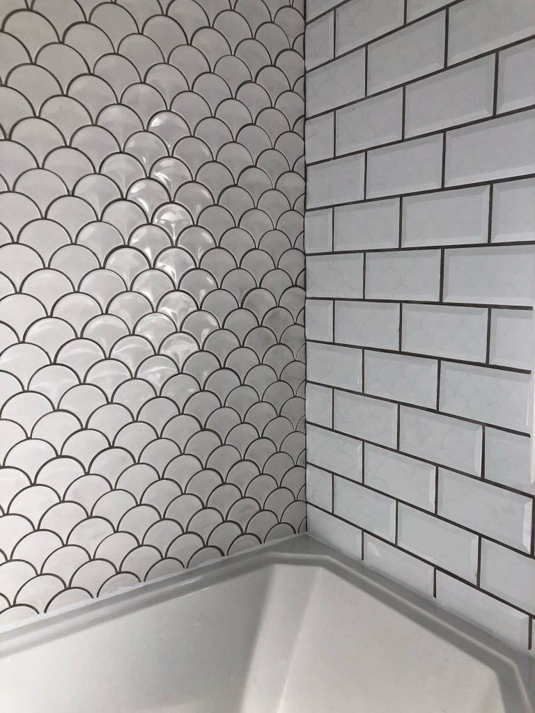
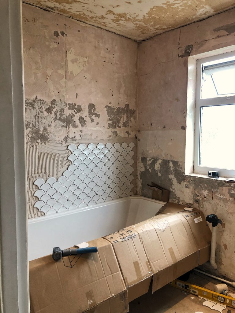
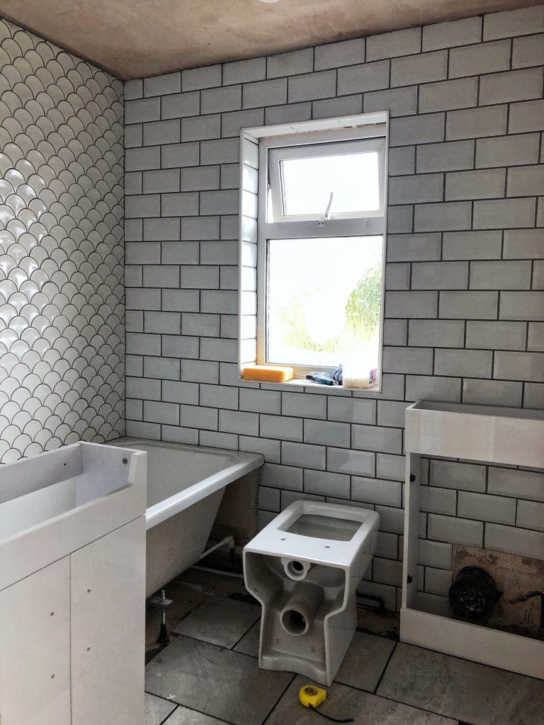
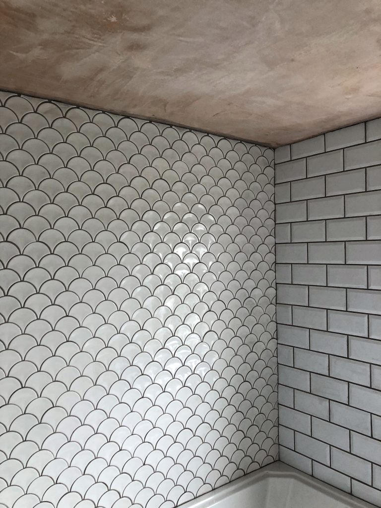
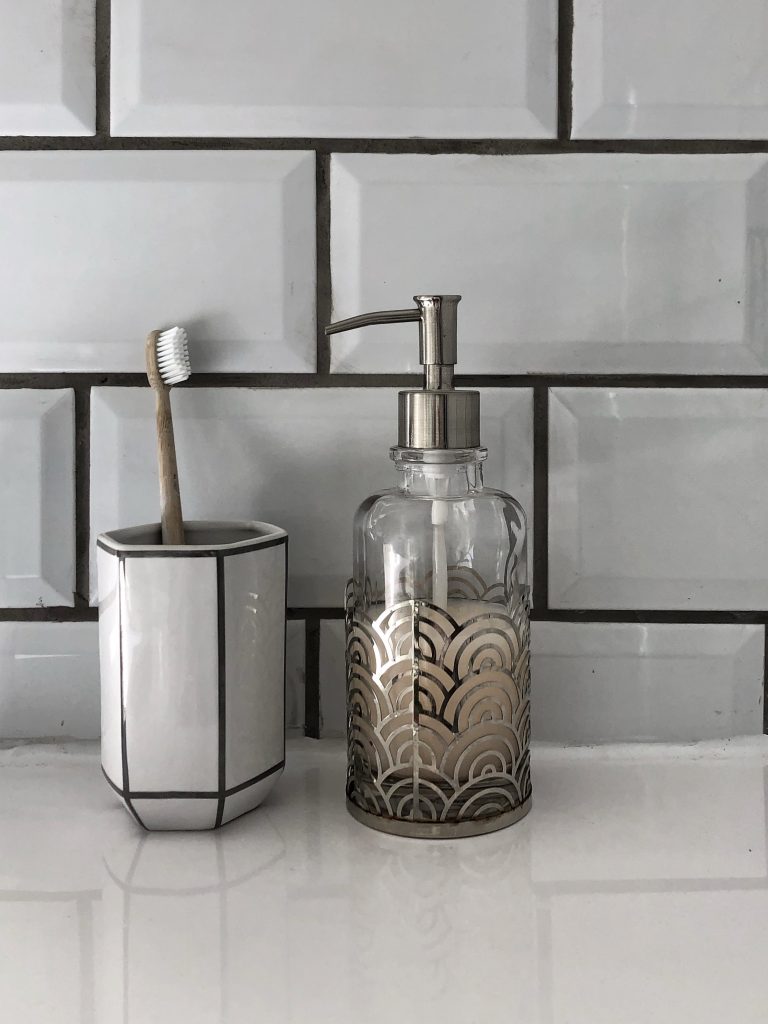
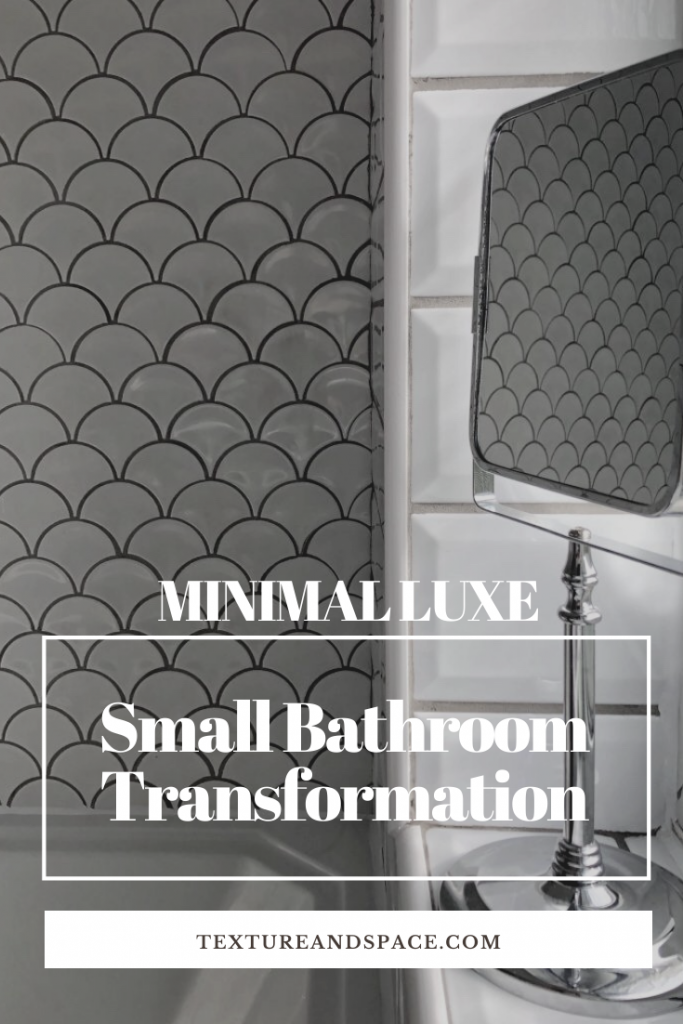
I wanted to recreate the minimal but luxurious feel of that hotel bathroom, and when I spotted the fan design tiles on Pinterest, I immediately knew that they were perfect for a feature wall – the fish scale effect that they created also gave a lovely nod to sea life, ideal for a bathroom. I paired the art deco inspired fan design with a metro tile for the other three walls as they were classic and simple, and I knew they were an affordable option.
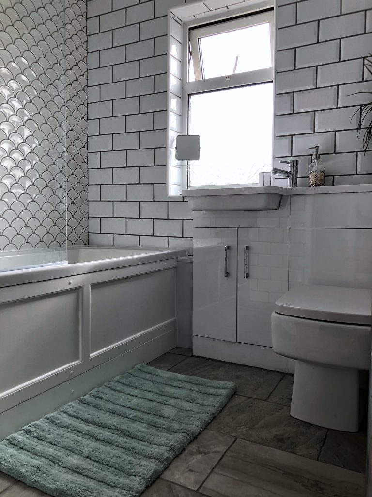
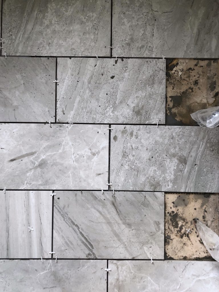
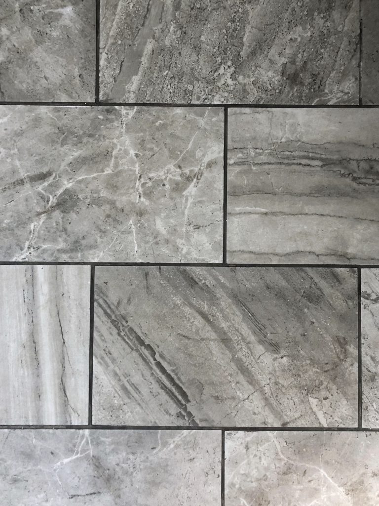
When it came to flooring, I opted for tiles again to complete the ‘hotel’ feel, and knew that a concrete-looking tile would bring an interesting tone and texture to contrast with the glossiness of the wall tiles. However, my first choice for floor tile was too expensive, and we somehow ended up panic-buying some large grey gloss tiles that looked more like marble and weren’t in fact suitable for bathroom flooring. Once we realised our error, I managed to find some more beautiful (and suitable) tiles that were closer to what I had originally wanted. The new floor tile was a matt porcelain design and every tile had its own unique shade and markings, which made me love them even more.
After a bit of debate between white and grey grout – the general consensus being that white was more timeless but harder to clean – I decided to go for grey grout as it would make the white wall tiles stand out more and would also tie-in nicely with the grey floor tiles.
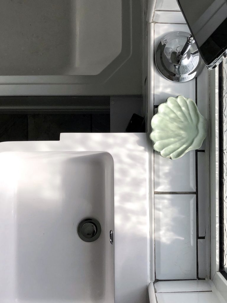
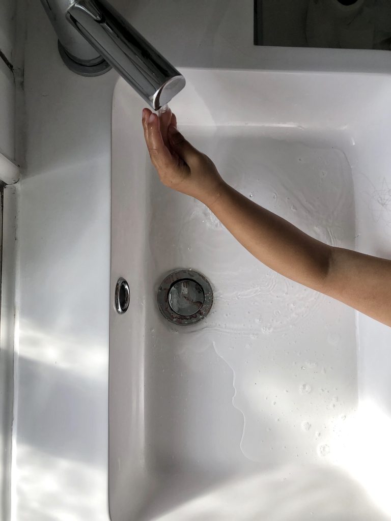
To compliment the fan tiles, I chose an art deco style bath with paneling on the front and ridge detail around the top edge. I selected a compact basin and WC unit that was contemporary with clean lines and featured a rectangular basin with rounded edges. The combi-unit housed a vanity cupboard and provided a handy little shelving area above the WC – I’ve never been more excited about a toilet.
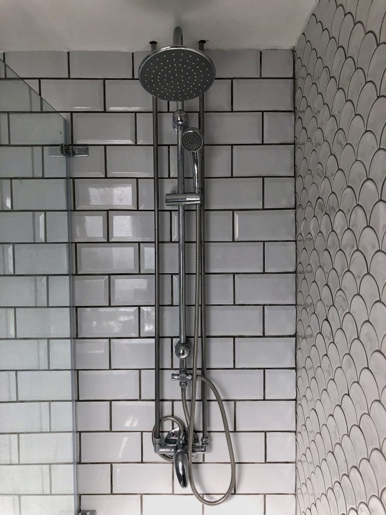
Waterfall Shower – when 2 became 1
We had initially wanted to have a shower where the pipes were concealed in the walls, however we soon discovered that the wall where the shower was to be fitted was too thin to do this. One solution for this was to build out a false wall to conceal the pipes, however as we were already tight on space this wasn’t a viable option, and by the time we had realised the issue it was too late to see if we could fit the shower in the opposite wall. So the only choice we had was to go with a surface mounted shower.
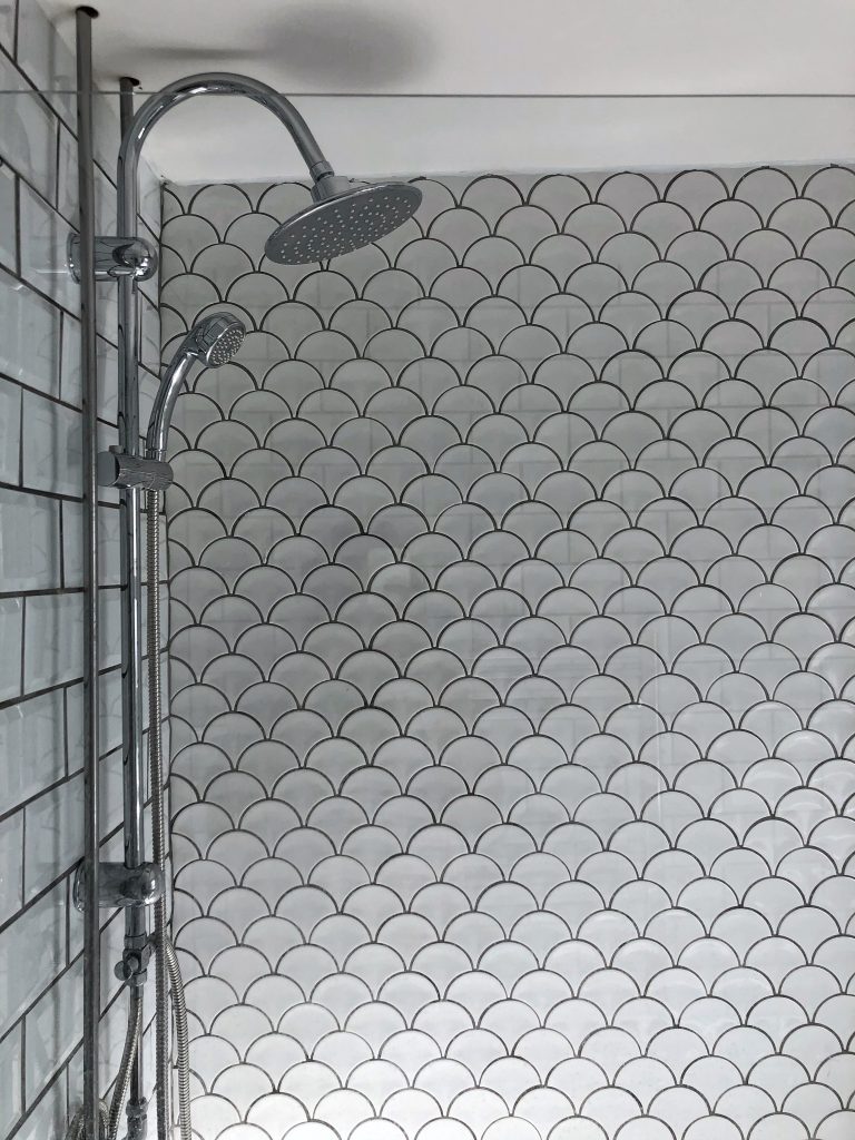
I was initially unable to find a surface mounted shower with a waterfall head that I liked, and though it was suggested that we might have to go without the waterfall head, I was adamant that this was not something I was going to compromise on. In the end my father-in-law (Del Boy to the rescue again!) came shower shopping with me, and whilst in the DIY shop, he had the ingenious idea of utilising parts from two different showers. This meant that we had the parts that we needed to make the shower fit and function, as well as the waterfall shower head that we needed for…err…umm….just ‘cause it feels nice, okay? Okay.
Finishing Touches
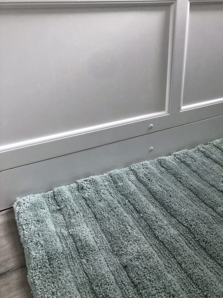
As with all of the spaces I inhabit, a plant was an immediate must when it came to styling the room, and then I carefully selected items to complement the art deco feel: a super-soft mint bath mat, a silver rectangular vanity mirror, a refillable glass soap dispenser finished with a scalloped metal trim, a hexagonal toothbrush holder, and a mint-coloured concrete shell soap dish from Smith & Goat. I also sourced a pull cord with a silver pendant on eBay – it’s the small details like this that create a more polished finish.
In order to keep our bathroom minimal and spacious, all the other bathroom paraphernalia has been neatly tucked away in the vanity cupboard. We have also resisted having a laundry basket or a waste bin in the bathroom, and perhaps most controversially, we don’t have a toilet roll holder (I’m hopeful that this may stop a certain someone from leaving empty loo rolls hanging about – stayed tuned!)
*Note for future guests – loo roll can be found in the vanity cupboard or most likely left out on the combi-unit shelf behind your head*
As with most home projects, there’s always a bit of compromise and always a bit of drama, and our small bathroom transformation has been just that. However, what we have managed to create is amazing and I’m so proud of the work that we have put in.
We now have a beautiful, calming and functional space that showcases simple textures with an elegant style, and I love it much more than that hotel bathroom because it’s ours.
Rebekah x
Pin for later:
Costs (approximate)
Below I have listed approximate costs for our bathroom renovation, which totals £2060.00. Please note that as we are having our whole house plastered I have made a guesstimate for the plastering work in the bathroom, and I haven’t included electrical costs as we had the whole house rewired. Further to this, we already owned a number of tools to carry out the work, and all of the labouring was carried out by Tom or another family member.
- Bathroom suite: £1230.00 – Victorian Plumbing and B&Q
- Tiles, grout & sealants: £500.00 – Topps Tiles, Tiles Direct and Wickes
- Skip hire: £200.00
- Ceiling re-plaster & paint – £130.00
Beautiful bathroom! Simple and luxurious 👏👏👏💖💖💖
Thank you! Just what I was hoping to achieve xx