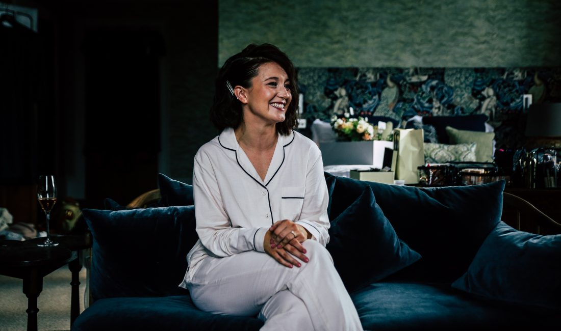
Every home has it’s own unique tale and texture, and it’s the design details combined with individual memories that layer and define someone’s personal space. Here Jade Scott, William Morris fan and charcoal wall lover, discusses the unique fabric of her home.
There are those who love nothing more than to scroll through the latest properties for sale on RightMove, reams and reams of houses, unfurling before your eyes. It is essentially your own property driven Instagram, your virtual Kirsty and Phil, minus the witty repartee. I myself find buying/selling/moving houses a little unsettling and stressful.
Will they accept our offer? Can we afford to go higher? What are we letting ourselves in for? These are just a few questions that instil panic in me. I assume that, for every hungry-eyed house buyer, functioning purely on the adrenaline of the property chase, there is another, cowering into their coffee cup, hoping that the seller doesn’t push their luck.
The day we decide to move again, I will have to meditate in the joy that comes with completing the purchase, as, after the contracts are signed and the keys exchanged, that is when I come alive.
“it definitely feels like home, but”
My husband Chris and I bought our first house as a project. We stripped back walls to bare brick, dipped and stripped old doors, knocked down walls and inserted a wood burner. After two years of hard work, helped by our parents and friends, we moved in.
Four years further down the line and, guess what? It’s still kind of a project. Ah, such is life and houses.
The walls are painted and the furniture is settled in, leaving deep rivulets in the berber loop carpets. It definitely feels like home, but there is always a sense of the next update project, just waiting for us to pop the lid on a tin of paint or, more dramatically, knock a little wall through for a much-needed utility space.
I’ve always loved older houses, so in our search there was a constant eye open for an original feature or an opportunity to strip back to reveal something authentic and of historical significance to the building. This search was no mean feat on a first-time buyer budget. What resulted was an offer accepted on a mid-terrace, late 30s property, not teaming with original character like I dreamt, but with promise and importantly, potential, to be something wonderful for our first home together.
“There’s nothing more textured than a bare brick house”
Once we had the keys it was open season on this previously unloved, former rental. All were welcome to visit, just bring a scraper and plenty of elbow grease.
The first step was figuring out what was to stay and what needed to go. I, armed with an obligatory glass of ‘house completion champagne’ in one hand, and my will to reinvent the space in the other, started in haste by tearing thick strips of wallpaper off a ‘feature wall’ that wore a rather gaudy brown and blue regal patterned paper like an ill-fitting winter coat (William Morris it was not). It was loud, brash, badly papered, and ran from the front bay window into the dining room. The simple act of tearing that paper down gave us a blank canvas to work with and opened up ideas for what would be the main hub of the home.
Unfortunately, there were no hidden wrought-iron fireplaces or dusty Minton tiles secreted beneath laminate; in fact, the only original piece of the house left are the bricks and mortar that give it body and our hallway flooring, a subtle linear parquet, which we restored to its former glory. No, what we actually revealed was a full back-to-brick project after every scrape of wallpaper took out a chunk of crumbling plaster. There’s nothing more textured than a bare brick house, that much I will say.
“the texture and layers of our home started to take shape”
The beauty of unravelling the terrible state of your home is that once the proverbial dust has settled, and the plaster is smoothed across the walls afresh, that space is your canvas. Now, I could have left some of the walls with bare plaster. I love that dusty pink hue, alas, it didn’t work in our space, which lacks in natural light in some rooms.
The features I craved, deep architrave and skirting, beautiful fireplaces and stone bay windows, we would have to bring in (where possible) and this is where the texture and layers of our home started to take shape.
“dark colours do not in fact make spaces smaller”
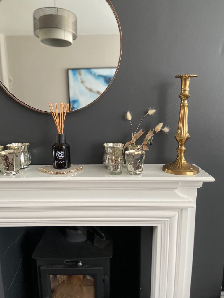
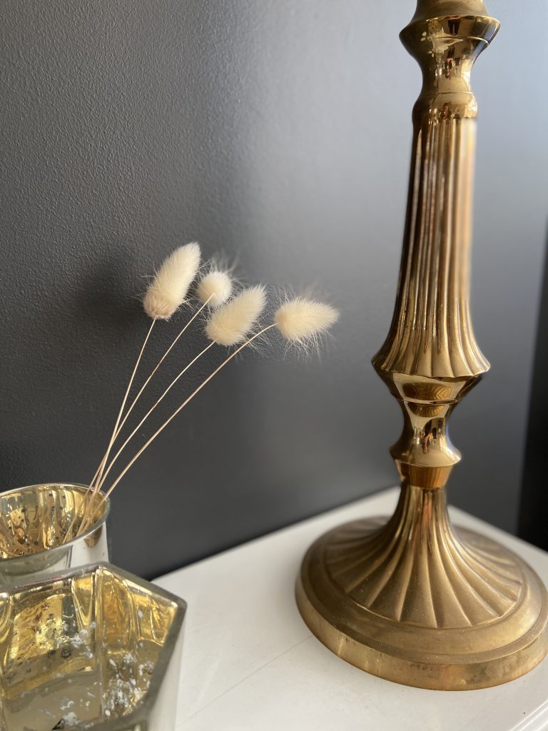
On the ground floor two chimney breasts in the lounge and dining room gave us the opportunity to knock out one for more space in the dining area and adding in a wood burner (one of two must-haves for Chris) in the lounge. The fireplace took shape by adding slate tiles to the base and a Georgian style surround in a simple white. Side note: this is Georgian in style only; there is nothing remotely original about this B&Q plywood item.
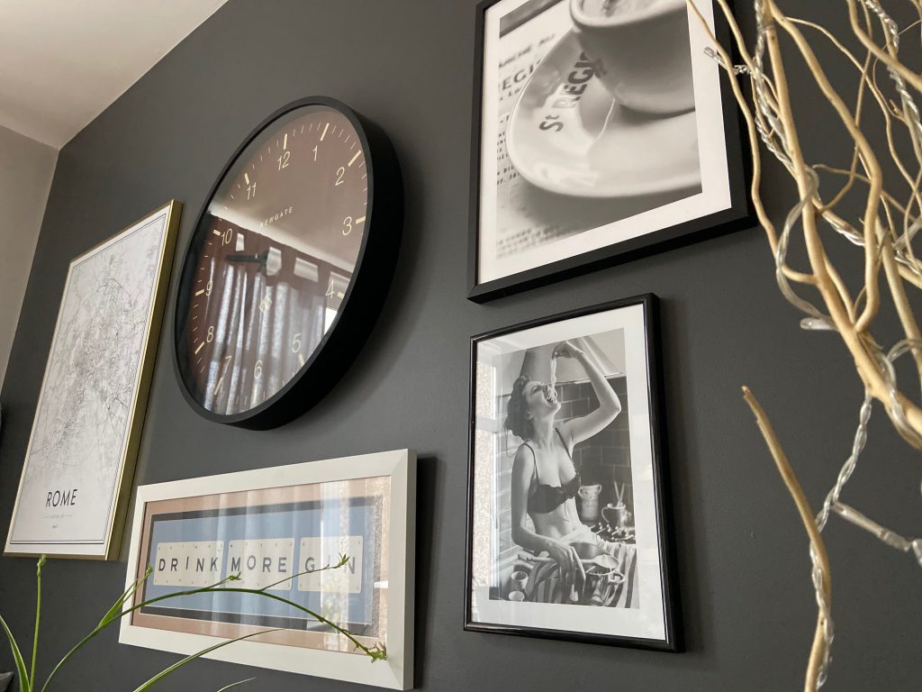
While I’m on the subject of this room, it is worth noting that I had wanted a charcoal black wall in the lounge since day dot. After some persuasion that dark colours do not in fact make spaces smaller, we took the paintbrush plunge and covered our fireplace wall in something called Greyfriar. I still love it now and will definitely take this colour with me, wherever we go next.
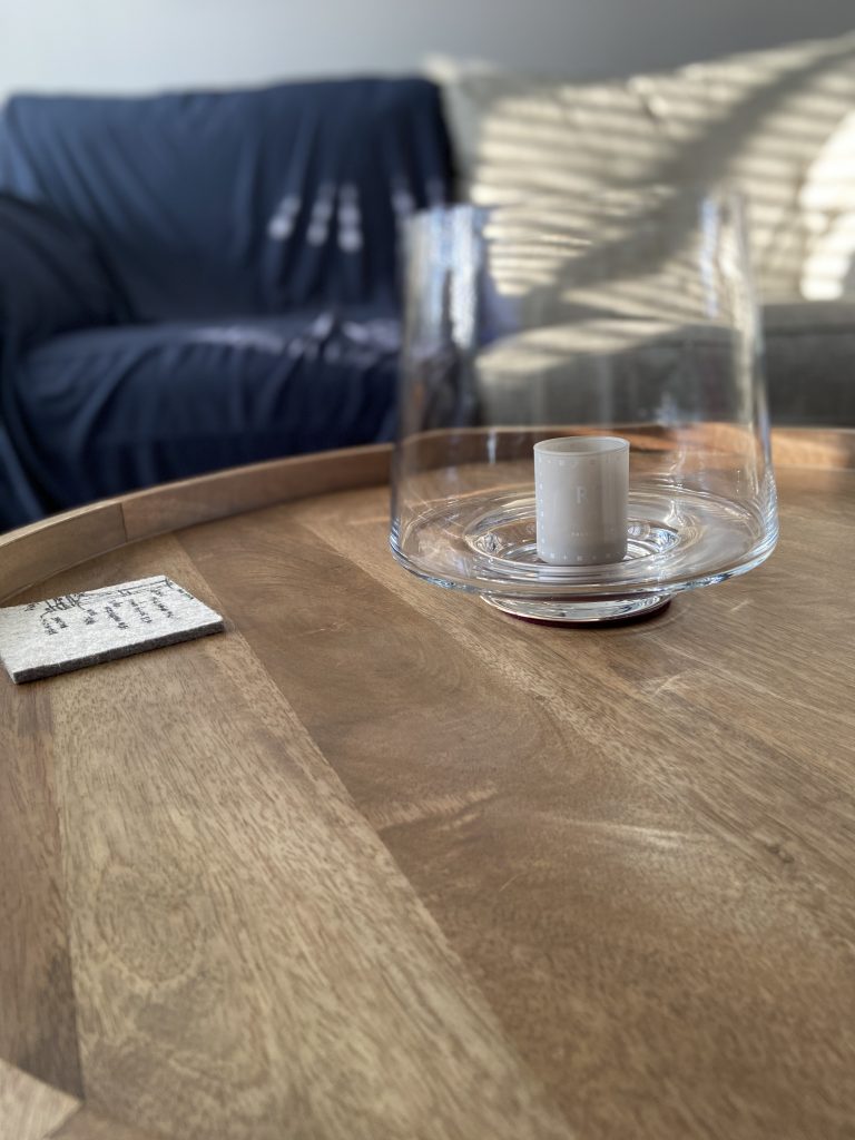
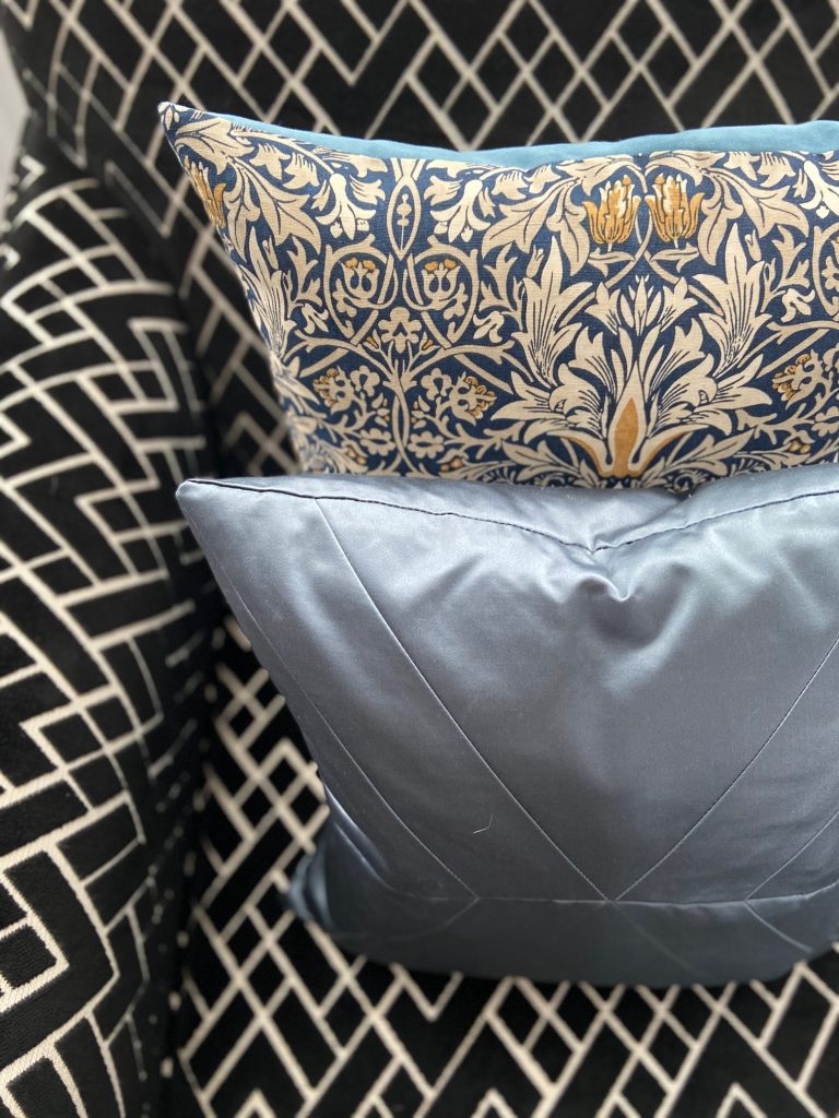
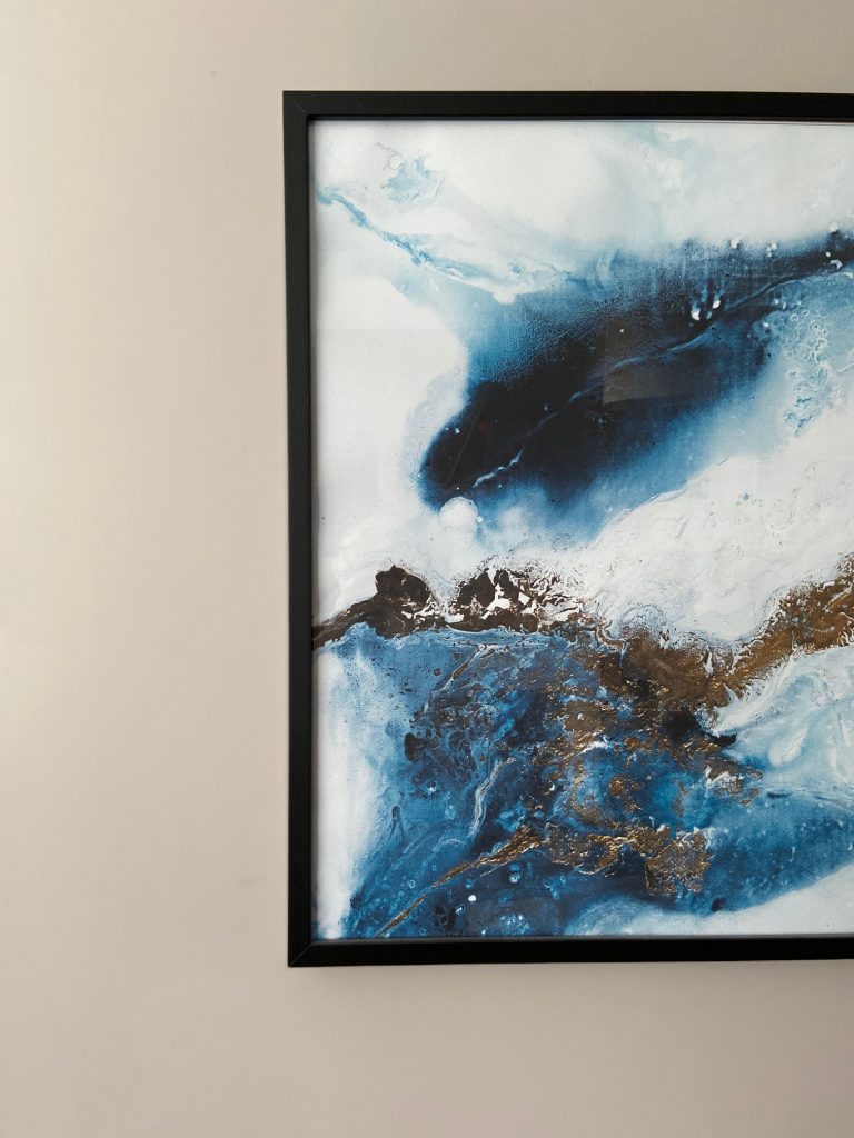
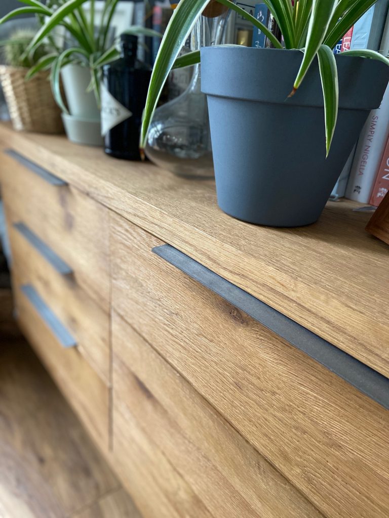
The rest of our lounge is muted for that calm you need when you slump onto the sofa at the end of a day. We’ve layered textures here with highlight furniture pieces; a black and cream armchair in velvet, adorned with textures of cushions. William Morris wallpapers are a favourite of mine but until a time when I can splurge on that, cushions in the famous fabrics is where I’m at. I’ve paired blues and forest greens with textures of wood found in the coffee table and media unit, not from a matching set, I prefer the natural blending of investing in one great piece at a time and hoping that it all works together in harmony.
“It is all TBC”
We have a plan to eventually separate out the lounge and dining room with either full length shutters or crittall. This was an original idea we had as we prefer the cosiness of a separate lounge but as yet haven’t landed on how to achieve it. Shutters create a lovely break in the light and help with that cosy feeling, but crittall is just cool and plays with our love of powder coated metal.
The texture of our doors, architrave and skirting has been the subject of much scrutiny over the years we’ve lived here. So much so that they are still not completely finished, but actually, we’ve come to love to rough and ready texture of the semi painted doors. To gloss or not to gloss, that is the question. That shiny, slick finish is not something that ties in with the rest of our house aesthetic and so we landed on satinwood for most of the interior woodwork. It is all TBC so just wish us luck as painting interior wood is very low down on my list of things I enjoy doing around the home.
“Not my usual choice”
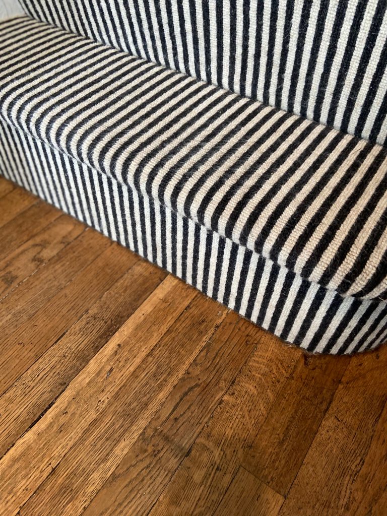
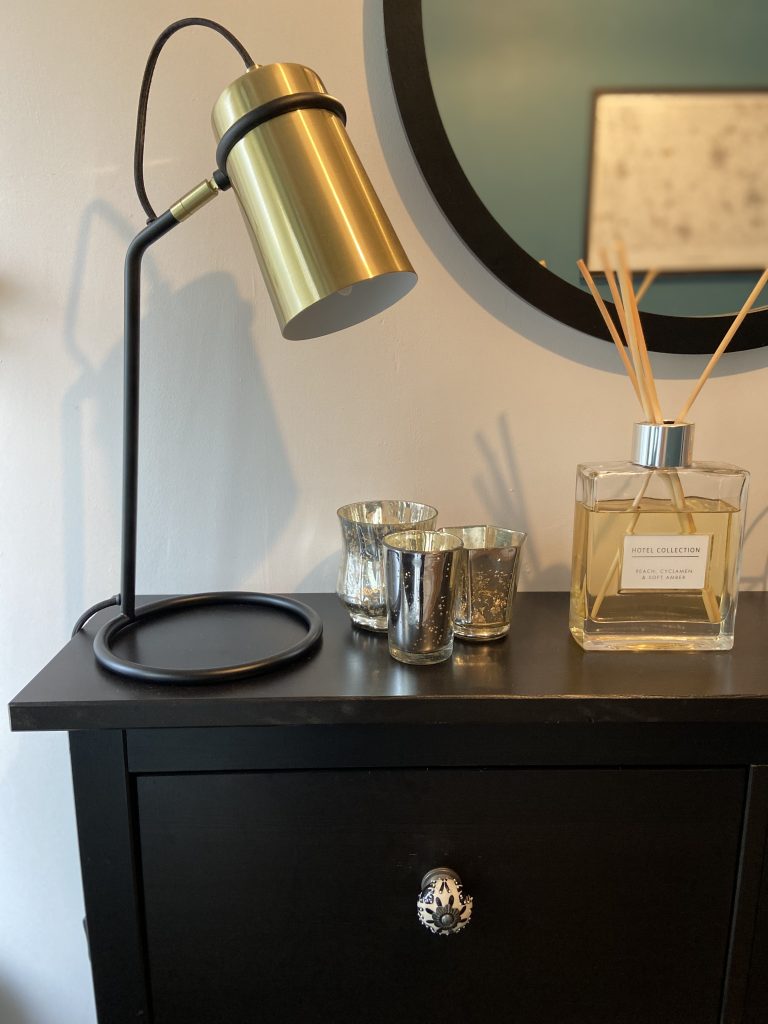
I’m a big fan of black and white so the hallway is an homage to monochrome but in a softer mix. Our striped black and cream carpet runs up the stairs and across the landing, working like a magic eye trick if you look at it while walking. I’ve jazzed up an IKEA shoe cupboard with some rather stylish knobs from Anthropologie and washed one wall with a barely there neutral tone; it’s a delicate wash of something called Just Walnut. On the other side is powerful covering of a teal tone. Not my usual choice but I want a rich, regal statement for the hallway, in a dark shade that would mask any scrapes and brushes.
The neutral palette then flows up the stairs and throughout the bedrooms and landing space, only interrupted by the crisp and clean white that we chose for our bathroom. In there, we (and I use the royal We here) tiled an entire wall in grey metro tiles. While we wanted something that felt fresh and clean, it was important to avoid clinical, so we opted for a deeper bevel on the metros and wood-effect tiles on the floor. The metro tiles reappear in the shower nook.
This space was a tricky one for us as we wanted to benefit from separating out the bath and shower, and once we’d used up every inch of available space to its fullest potential we realised that there was not, in actual fact, a lot of space for the ‘stuff’ of bathroom living. This is something we’re working on; the hope is to bring in some natural woods and brass to warm it all up and provide much-needed shelving.
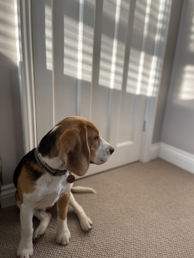
Our own room is a softer still blend of creamy berber loop carpet, Scandinavian style furniture and a willow paper feature wall, all delicately lit by the afternoon sun that streams in through our white blinds. It is fairly minimal, super calming, with layers of softness in the throws and cushions that adorn the bed.
Texture is created in our home, not just by the physicality of fabrics and materials, but by the emotional layers, accessories and memories that we’ve built up over the years. What began as a peeling off of an epic novel’s worth of paper and wood chip, continued forth in a re-plastering of surfaces and a building up of new memories in spaces, the layers of our life coming together in design form.
I’ll leave you with this House Haiku:
When will reno end?
When walls sing with textures of
William Morris
Visit Jade’s blog www.notthedirectorschair.com
Blog Instagram: @notthedirectorschair
Personal Instagram: @scottjadey